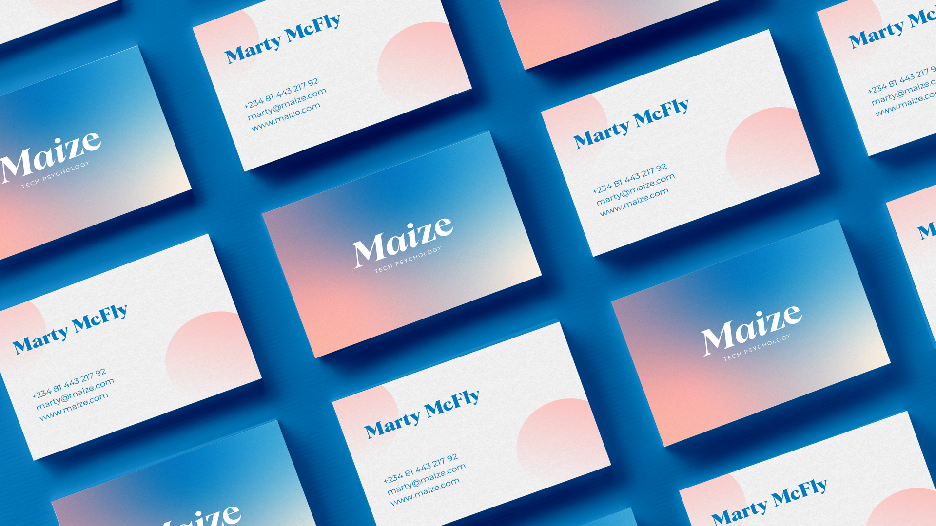
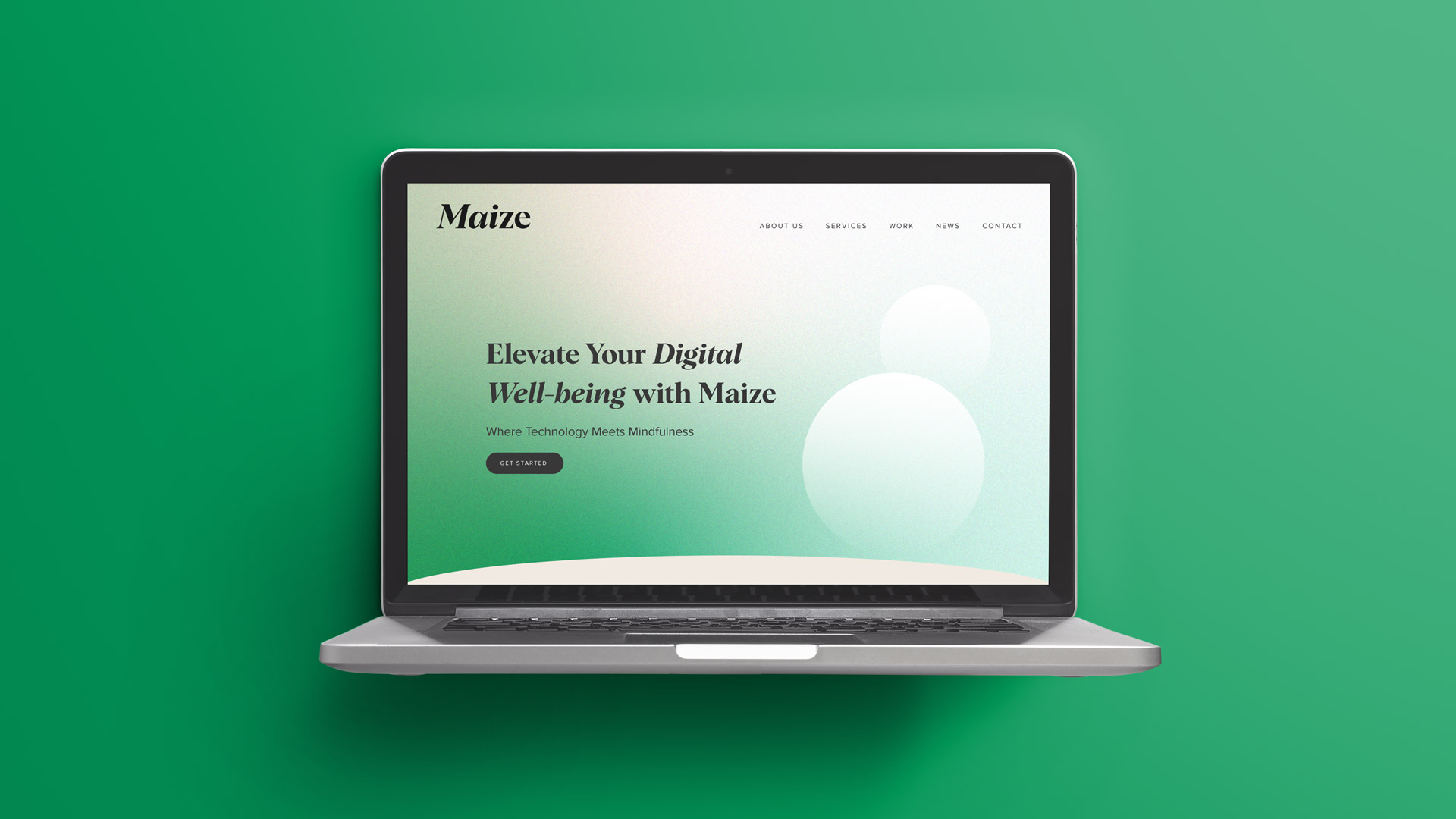
Visual identity, Web design
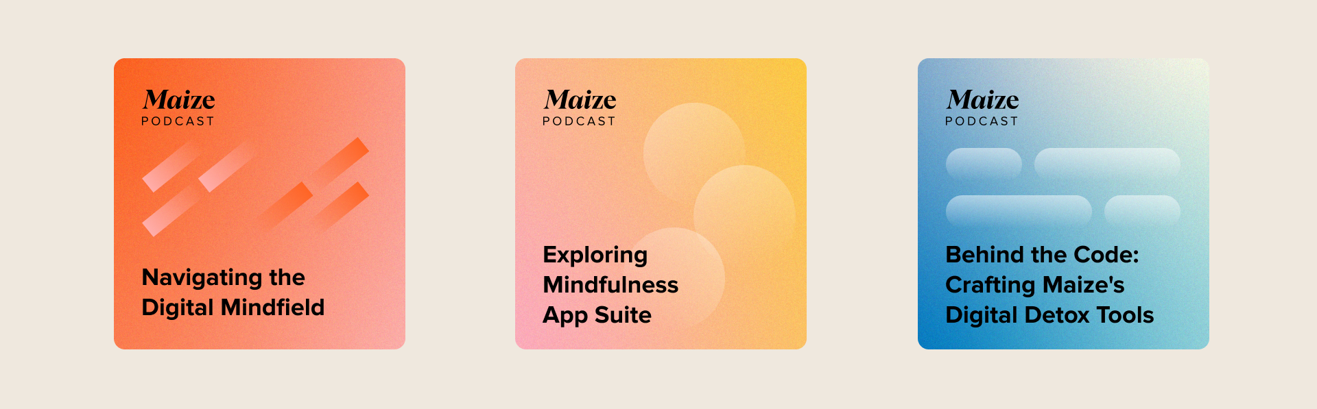
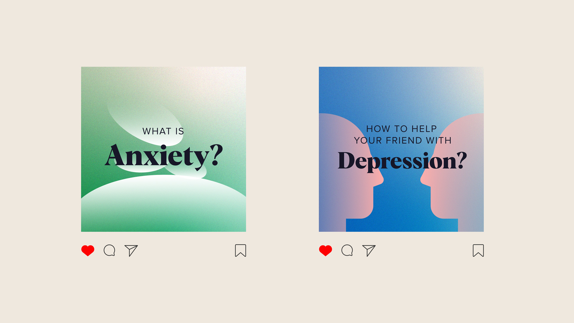
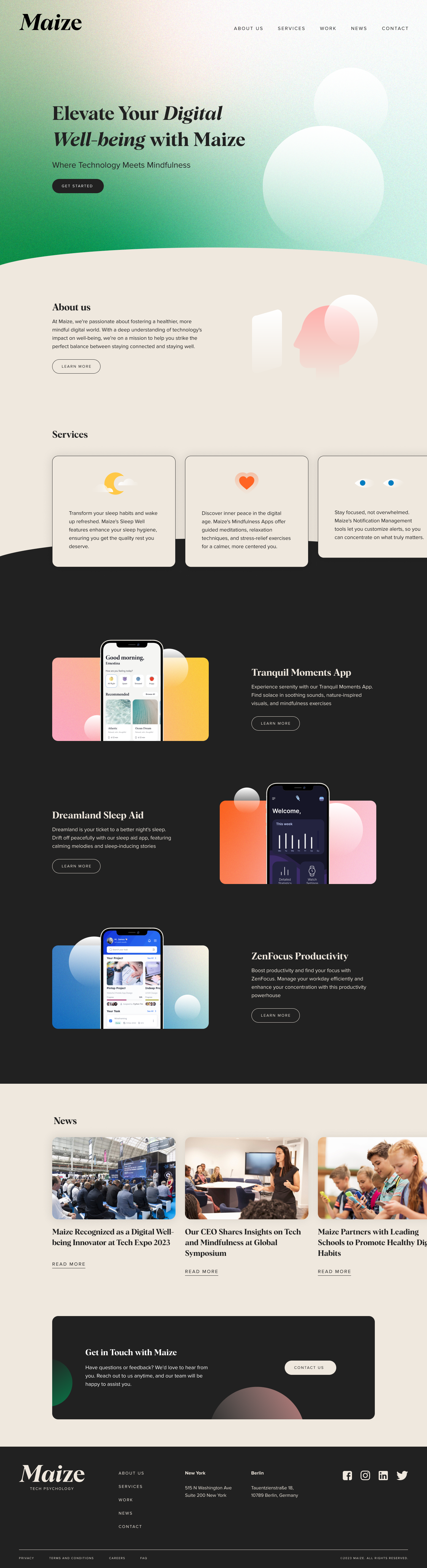
The idea was to show in a typographic way the association of two types of science; technical science and psychology as a social science. Three letter characters are in italics and are approaching the other two characters as a sign of merging into one, coming closer. That opened me to the idea that the entire branding follows the visual representation of merging of two different sciences into one whole.
This merging and blending would be explained visually by using opacity on various shapes and gradients. Everything that visually goes from one to the other represents the commonality but at the same time the visible difference of the two sides.
*This project was part of the idea for a similar project, with a different name. I was sorry to see these visuals and the website ended up in the trash.
Roberta Cindrić