Art direction
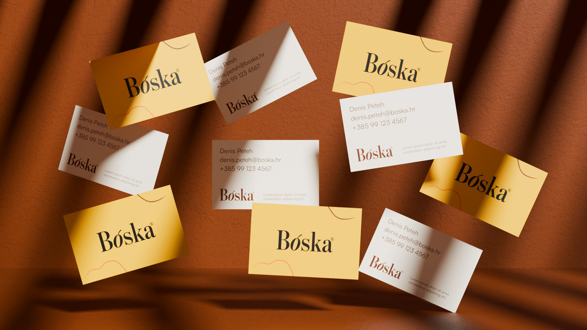
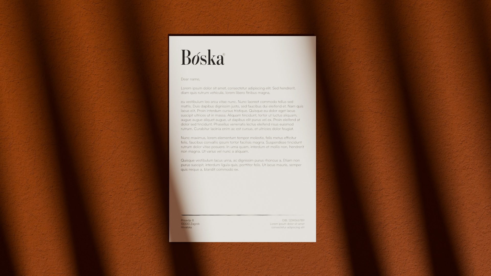
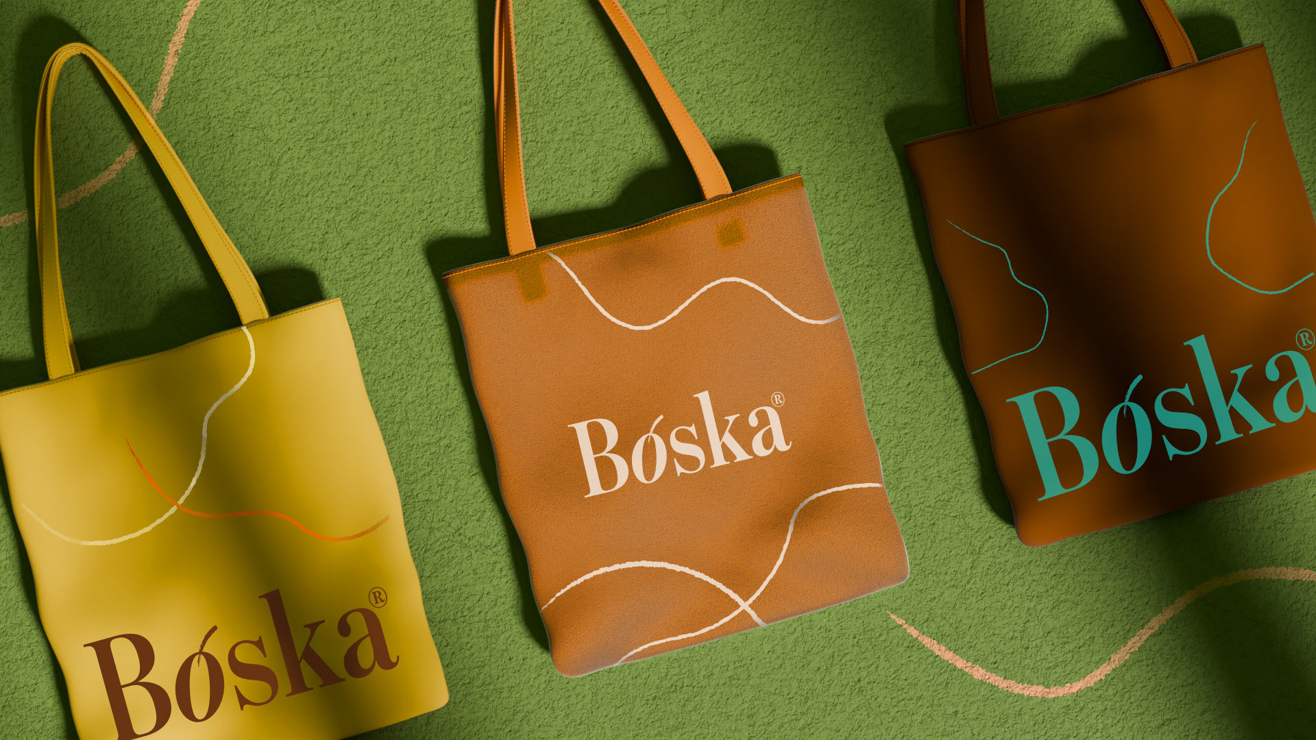
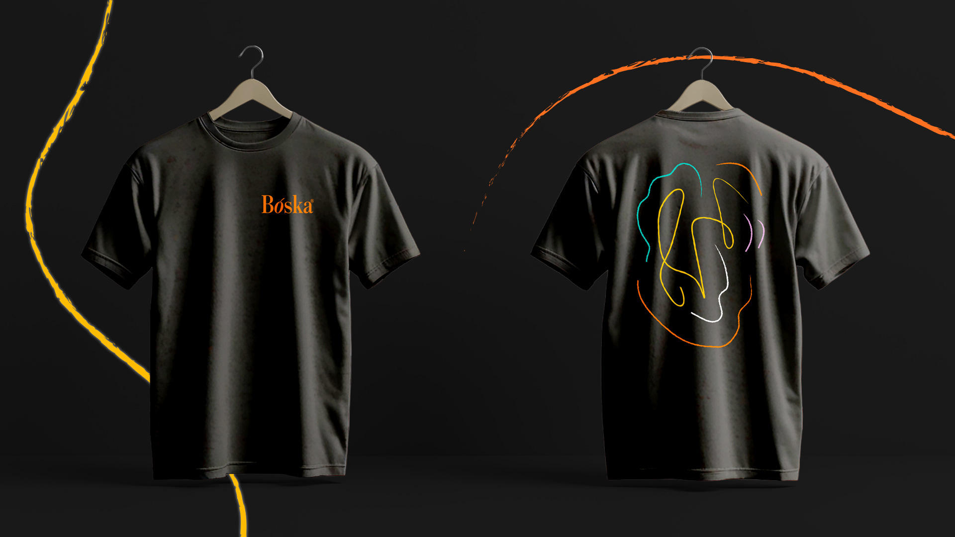
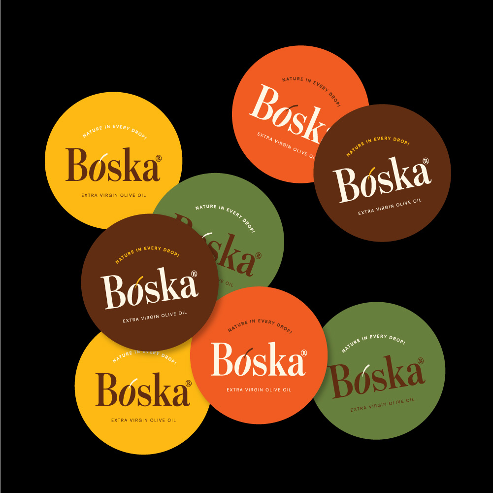
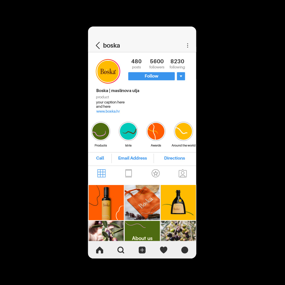
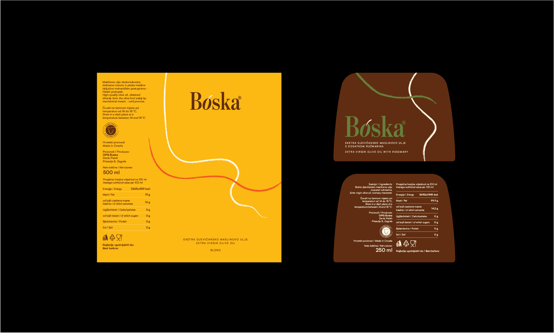
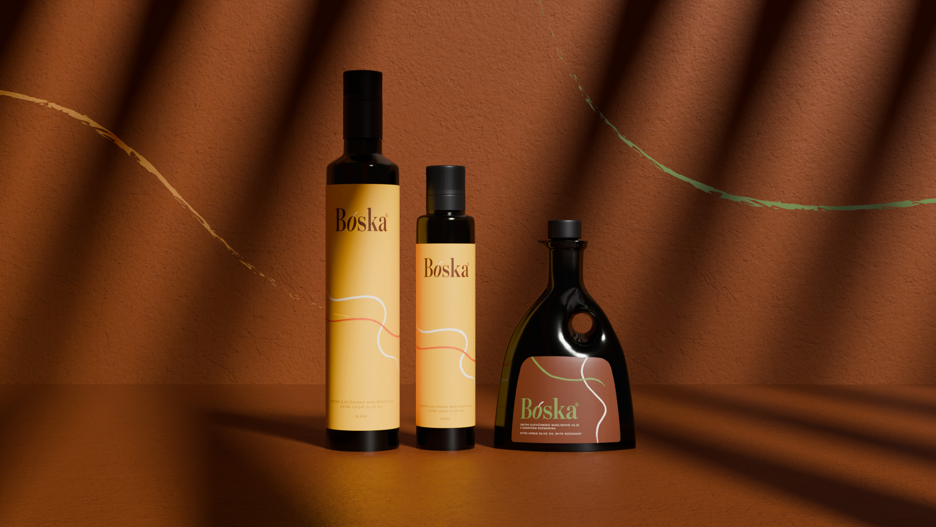
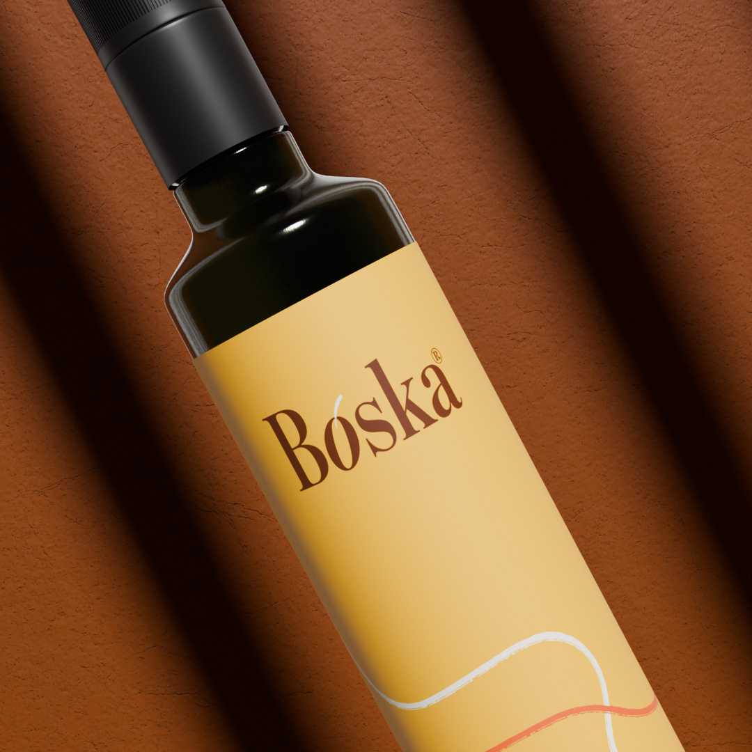
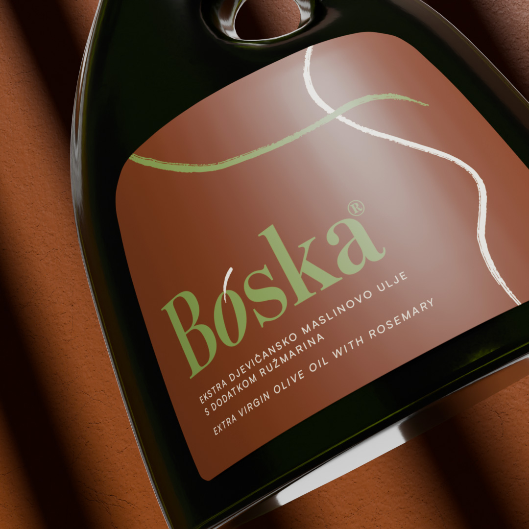
Boska is an olive oil from Istria, named after the land where the olive trees now grow. I created the entire visual identity; from the concept and logo to label design and 3D renders. The idea behind the logo was to turn the letter “O” into an olive, with a small hand-drawn line as the stem. These lines appear across all materials, adding a sense of something personal and handmade, just as this olive oil.
The color palette is based on earthy tones, inspired by the Istrian landscape. The labels are simple, featuring only hand-drawn lines that reflects the brand’s simplicity. The target audience are people aged 30–40 who value quality, authenticity, and good design. I created all bottles and label mockups in Blender.
Roberta Cindrić